
.svg)


.png)
.png)

Style guide
The design standards
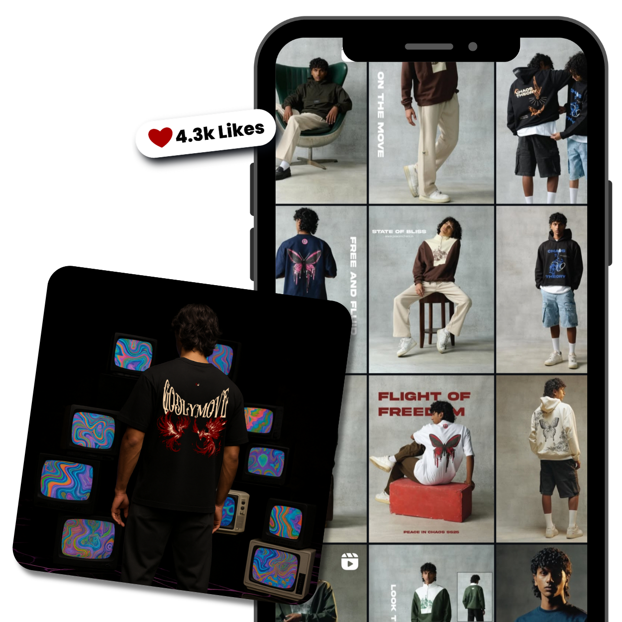
A unified system designed to maintain consistency across all visual and brand elements, ensuring that every touchpoint—reflects our identity with clarity, cohesion, and purpose.
1. Typography
Font
Sora
Size : 62px
Line Height : 110%
Latter Spacing : -4%
Heading 1
Size : 52px
Line Height : 110%
Latter Spacing : -4%
Heading 2
Size : 48px
Line Height : 110%
Latter Spacing : -4%
Heading 3
Size : 40px
Line Height : 110%
Latter Spacing : -4%
Heading 4
Size : 36px
Line Height : 130%
Latter Spacing : -4%
Heading 5
Size : 32px
Line Height : 130%
Latter Spacing : -4%
Heading 6
Size : 20px
Line Height : 156%
Latter Spacing : -2%
Body 1
Size : 18px
Line Height : 156%
Latter Spacing : -2%
Body 2
Size : 16px
Line Height : 156%
Latter Spacing : -2%
Body 3
Size : 14px
Line Height : 156%
Latter Spacing : -2%
Body 4
2. Color
Bright Blue
#171717
Patterns Blue
#202020
Blue Chalk
#B8B8B8
Midnight Blue
#f6f6f6
Black
#121212
Gray
#787b7f


%20(2)_page-0001.jpg)